
Beaver Builder
Bread crumbs / Will Be / Placed / Here / When Available
Here’s an overview of the Beaver Builder plugin, Beaver Builder Theme, and a little bit about what Beaver Themer adds if you need it.
Plugin vs. Theme vs. Beaver Themer
How Beaver Builder Works With WordPress
When you build a WordPress site, your web page is divided into different parts — the content area (where your main text, images, and modules go) and the outer sections like the header, sidebar, and footer.
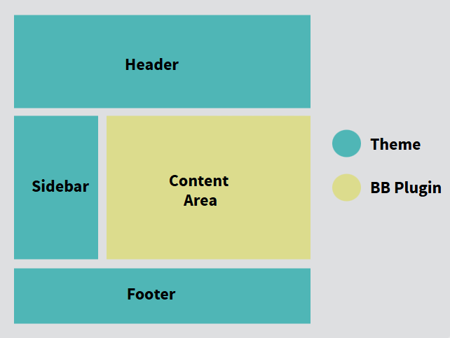
Here’s how Beaver Builder fits into each of those areas:
- Beaver Builder (Plugin):
This is where you design the main part of your page the content area. With its drag-and-drop tools, you can build detailed layouts, add text, images, videos, and more. By default, it works on pages, but you can also turn it on for posts or custom post types in the settings. - WordPress Theme:
Every WordPress site needs a theme it’s what controls the parts outside the content area, like the header, footer, and sidebar. It also decides how post details (like the title, author, categories, and featured image) are displayed. Some themes even let you hide or customize these areas for individual pages using page templates. - Beaver Themer (Add-On):
If you want to design beyond the content area for example, creating a custom header or footer Beaver Themer makes that possible. It extends Beaver Builder’s power so you can design the parts normally controlled by your theme. You can also choose which pages your new layouts show up on and who gets to see them.
In short:
- Beaver Builder = build the main page content.
- Theme = controls the rest of the site’s structure.
- Beaver Themer = customize those “outside” areas for full design freedom.
Understanding How Beaver Builder Works with WordPress
Before you dive into building with Beaver Builder, it’s helpful to understand how WordPress pages are structured and how Beaver Builder, its add-ons, and themes work together to give you full design control.
This guide breaks things down into three main parts:
- Beaver Builder Theme – How to customize areas outside your page content like the header, footer, and sidebar.
- Beaver Builder Plugin – The drag-and-drop page builder for your main content area.
- Content Layout Basics – How rows, columns, and modules shape your design.
1. Beaver Builder Plugin: Build Beautiful Pages, Visually
The Beaver Builder plugin is a powerful drag-and-drop tool that lets you design your page content visually, what you see is what you get (WYSIWYG). You don’t need to touch code or worry about formatting.
Start with a layout template, prebuilt rows, or a blank page
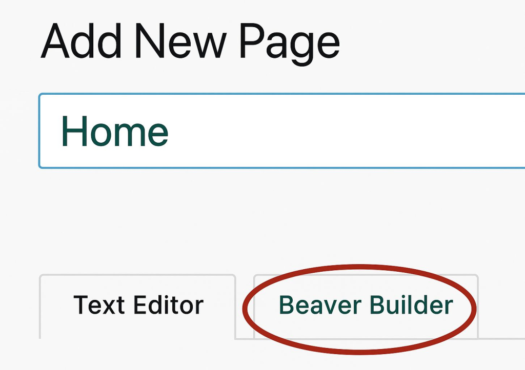
When creating a new page in WordPress, you can launch Beaver Builder from:
- The Beaver Builder button (if the standard WordPress block editor is enabled).
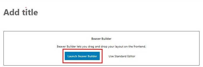
Or The Beaver Builder tab (if the standard editor is disabled).
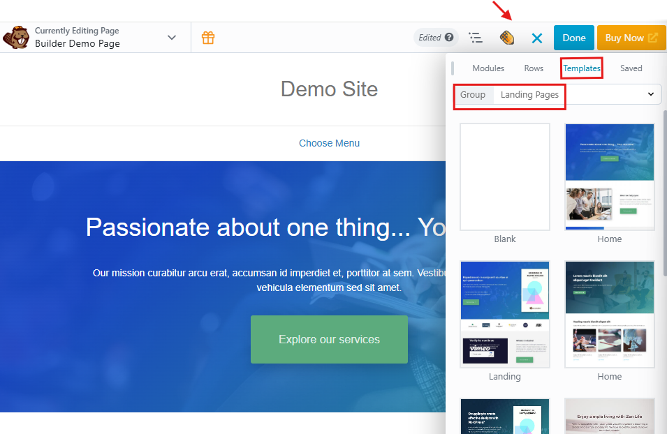
On the editing page, you’ll see the Beaver Builder admin bar at the top of the screen. Click the Plus icon on the upper right side, and do any of the following to get started.
Once inside the builder:
- Start with a Template: Choose from ready-made page layouts and customize them. Click the Templates tab and click any template to insert it. Choose a different template type in the Group field for more choices. See this article on layout templates for more information.
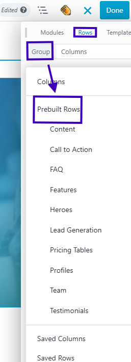
Use Prebuilt Rows: Pick a row structure and drag it into your page.
Click the Rows tab, in the Group field select Prebuilt rows, then choose a category and drag your selection into the layout. See this article on prebuilt rows.
Quick Tip: A built-in quick-start video is available under Tools → Help in the Beaver Builder admin bar, perfect for beginners.
2. The Basics of Page Layouts
Beaver Builder organizes your content using rows, columns, and modules: When you drag content modules from the Content panel to the layout, the rows and columns are automatically created. As your layouts become more complex, with child columns, sometimes it’s easier to drag in row layouts first, then drag content modules into them.
Rows: The main horizontal sections of your layout.
Columns: Divisions inside rows that let you place content side-by-side.
Modules: The actual content elements (like text, images, sliders, or buttons).
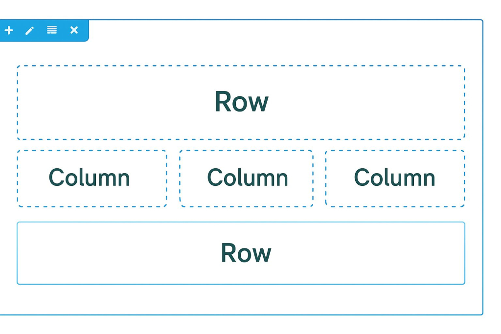
For example, a single row can have three columns for three different content blocks or you can use multiple rows for more control over spacing and layout.
Responsive by Default
All Beaver Builder layouts are automatically optimized for
desktop, tablet, and mobile. You can preview and adjust your design for each screen size using
Responsive Editing Mode no extra work required.
Saving and Reusing Your Work
You can save any row, module, or entire page layout to reuse later. Saved items can be:
Templates: Save full-page layouts for future projects or export them to other sites.
Global: Edit once and it updates everywhere.
Reusable: Use as a base but customize each version individually.
Using Beaver Builder with Posts
By default, Beaver Builder works on pages. But you can enable it for posts and custom post types, too. Note that archive pages (like blog post lists) are generated automatically by WordPress but you can design custom versions using the Beaver Themer add-on. See the article on using Beaver Builder with Posts for more information.
Info
Because WordPress index and archive pages are generated on the fly, you cannot use Beaver Builder to lay out those pages, though you can create Beaver Builder layouts that simulate the generated WordPress pages. for more information, see the article on generated WordPress archives vs. Beaver Builder layouts. Or, you can use the add-on Beaver Themer plugin to create custom WordPress index, archive, and search result layouts.
Beaver Builder Theme: Full Control Beyond the Content Area
While Beaver Builder handles the content inside your page, a WordPress theme controls everything else like the header, footer, sidebar, and overall site structure.
The Beaver Builder Themeis designed to work perfectly with Beaver Builder and Beaver Themer, giving you more control over the look and feel of your site. You can customize it easily through the WordPress Customizer or admin panelunder Appearance menu→ Customize.
Here’s what you can do with the Beaver Builder Theme:
- Use Presets: Apply pre-styled designs quickly without editing every setting.
- Customize Layouts: Control the look of headers, footers, sidebars, blog archives, and more.
- WooCommerce Settings: Adjust how your online store pages look.
- Set Global Styles: Choose default colors, fonts, and button styles for all pages.
- Add Custom Code: A section to add code. Insert scripts or snippets into the head or body of your site.
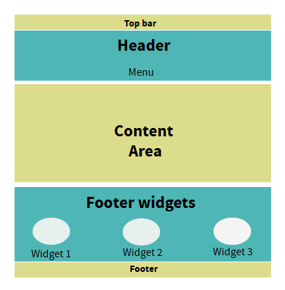
Header, Footer & Sidebar Options
- Header: Includes an optional top bar and a main header for your logo and navigation.
- Footer: Can include a widgets area which appears above the footer and a main customizable footer bar similar to the top bar in allowing one or two columns.
- Sidebar: Appears on blog and archive pages by default but can also be added to individual pages.
You can’t create multiple unique sidebars by default, but you can use Beaver Builder’s Sidebar module to customize them or use a third-party plugin for more control.
Here’s a diagram showing the header and footer subareas.
Note:
The sidebar in Beaver Builder is optional, but when enabled, it appears on all archive and post pages, as well as on individual pages where the WordPress template is set to display it. By default, there’s only one sidebar whose widget content shows wherever it’s activated. If you want different sidebars for specific pages or posts, you’ll need a third-party plugin or custom code. Alternatively, you can create a custom sidebar layout using Beaver Builder’s Sidebar module.
4. Theme Defaults for Beaver Builder Layouts
The Beaver Builder Theme also lets you set default design settings to keep your site consistent without having to style every page manually. You can pre-set things like:
- Accent Color: Default link and button color.
- Typography: Fonts and sizes for headings and body text.
- Background: Set a default color or image for all content areas.
- Lightbox Settings: Choose how images behave when clicked.
- Dynamic Year Short code: Automatically display the current year in your footer or content.