
Beaver Builder
Bread crumbs / Will Be / Placed / Here / When Available
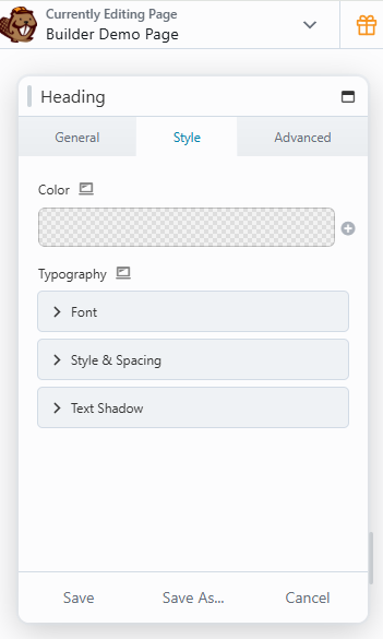
Typography
The Typography section lets you customize how text looks in most Beaver Builder modules that support custom text. These options override your WordPress theme’s default styles, giving you complete control over your font, size, spacing, and more.
Tip: You can use the Responsive Toggle to set different typography styles for desktop, tablet, and mobile views.
Font Settings
The Font options help you control how your text looks and behaves across devices.
Family
Choose a font family from system fonts or Google Fonts.
Tip: If your chosen Google Font supports Latin Extended characters, you can enable them with fl_builder_google_font_args (or fl_font_subset in the BB Theme).
Weight
This determines how bold or light your text appears. Options depend on the selected font. For example, system fonts may offer Light, Normal, or Bold, while Google Fonts like Cabin include Normal, Medium, Semi-Bold, and Bold.
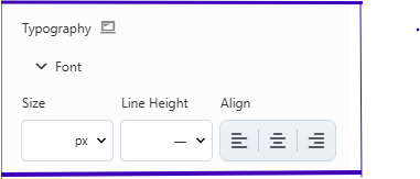
Size
Set the text size using units like px, em, rem, or vw.
vwscales text size based on the browser’s width.- If left blank, the default theme size is used.
Tip: When using vw, ensure the Base font size in Global Settings is set in pixels (default: 16px). The size will scale smoothly using a formula like calc(16px + 1vw).
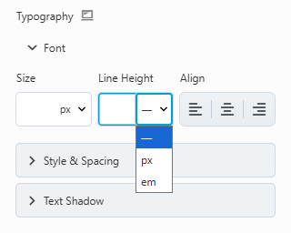
Line Height
Adjust the vertical space between lines. You can use unit-less values (recommended) or set a specific unit like px or em.
Alignment
Style & Spacing Options
The Style & Spacing section gives you more control over the appearance and formatting of your text.
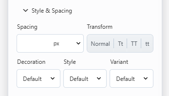
Spacing
Adjust the horizontal spacing between letters (letter-spacing in CSS).
Transform
Change text casing without retyping:
- Normal – Keeps original text.
- Capitalize – Capitalizes each word.
- Uppercase – All caps.
- Lowercase – All lowercase.
Decoration
Control text decoration:
- Default – Uses the theme’s style.
- None – Removes decoration.
- Underline, Overline, or Line Through – Adds decorative lines.
Style
Set the text style:
- Default – Inherits theme style.
- None – Standard upright text.
- Italic – Uses the font’s italic version (or a browser-generated one).
- Oblique – Slanted text, slightly different from italic.
ℹ️ Note: “Italic” is usually a specially designed font style, while “Oblique” is a slanted version generated by the browser.
Varient
Choose between:
- Default – Inherits theme setting.
- Normal – Standard text.
- Small Caps – Capitalizes letters with varying heights for a refined look.
Difference: “Uppercase” makes all letters the same height, while “Small Caps” uses larger caps for originally capitalized letters and smaller ones for lowercase letters.
Text Shadow
Add depth with a shadow effect behind your text. You can customize:
- Color
- Offset (X/Y) – Position of the shadow horizontally and vertically.
- Blur – Controls how soft or sharp the shadow appears.
Summary:
The Typography section in Beaver Builder helps you create visually appealing, readable, and responsive text without writing any code. From font selection to spacing and decorative styles, these tools give you full creative control to make your site’s text match your brand perfectly.