
Beaver Builder
Bread crumbs / Will Be / Placed / Here / When Available
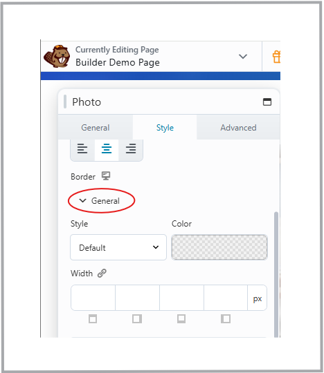
Border
The Border settings in Beaver Builder let you control how rows, columns, and modules are visually framed using borders, rounded corners, and shadows.

How to Use:
- Open the row, column, or module settings and go to the Style > Border section.
- Under Style, choose how your border looks — None, Solid, Dashed, Dotted, or Double.
- Use the Color Picker to set the border color.
- Adjust the Width for each side (top, right, bottom, left). Use the link icon to apply one value to all sides.
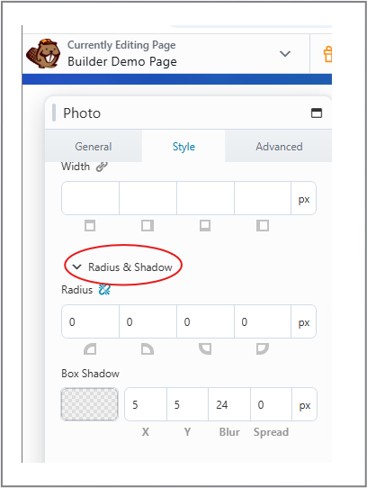
Radius & Shadow:
- Radius: Adds rounded corners. Adjust each corner individually or link them for uniform rounding.
- Box Shadow: Adds depth to your content. Control color, X (horizontal) and Y (vertical) offset, blur, and spread using sliders.
Tip:
Use the Responsive Toggle to adjust border, radius, and shadow settings for desktop, tablet, and mobile views. Keep shadows soft and borders minimal for a clean, professional layout.