
Beaver Builder
Bread crumbs / Will Be / Placed / Here / When Available
Outline Panel
Below is a polished version tailored specifically for a Beaver Builder support page, using clear headings, instructional tone, and consistent terminology aligned with Beaver Builder documentation standards.
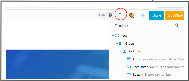
The Outline Panel provides a structured, high-level view of all content within your Beaver Builder layout. It allows you to view, navigate, edit, and reorganize rows, columns, modules, and container modules from a single interface. This is especially helpful when working on long or complex pages.
When to Use the Outline Panel
The Outline Panel is ideal when:
- Managing large or content-heavy pages
- Reordering rows or modules located far down the page
- Quickly locating and editing specific layout elements
- Viewing the overall structure of your layout at a glance
Instead of scrolling through the page, you can interact with all layout elements directly from the Outline Panel.
Accessing the Outline Panel
To open the Outline Panel:
- Click the Outline icon in the Beaver Builder Top Bar.
- The panel opens and displays your layout structure in an outline (tree) format.
Tip
The Outline Panel does not include its own drag handle. To prevent it from overlapping your layout:
- Open the Content Panel.
- Use its drag handle to pin it to the right side of the layout.
- Click the Outline Panel icon.
The Outline Panel will then overlay the Content Panel instead of the page layout.
Searching for Content
The search feature allows you to quickly locate specific layout elements.
To search:
- Click the Magnifying Glass icon in the Outline Panel.
- Enter part of a row, column, or module name.
- Matching nodes will be highlighted automatically.
You can also search by label, ID, or class name if these are known.
Expanding and Collapsing Items
You can control how much of the layout structure is visible:
- Use the Actions menu (Ellipsis icon) to expand or collapse all items in the tree view.
Tip
The Outline Panel remembers which items you have expanded or collapsed using persistent storage, allowing you to maintain your preferred view while editing.
Keyboard Shortcuts
The Outline Panel includes keyboard shortcuts to improve workflow efficiency:
- Toggle Outline Panel: Shift + O
- Expand or Collapse Tree View: Shift + T
Navigating the Layout
- Single-click any item in the Outline Panel to scroll directly to that row, column, or module in the layout.
- Double-click an item to open its settings panel.
Moving Content
You can reorder layout elements directly within the Outline Panel:
- Drag and drop rows, columns (excluding child columns), and modules to reposition them.
- This is particularly useful for rearranging content on long pages.
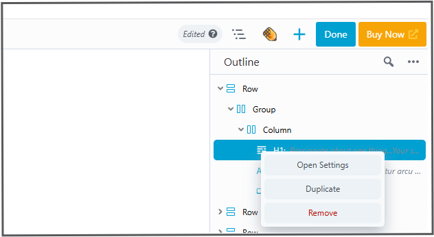
Context Menu (Right-Click)
Right-clicking on any item in the Outline Panel opens the Context Menu, providing quick access to commonly used actions without scrolling through the layout.
Available actions include:
- Open Settings – Opens the settings panel for the selected item.
- Duplicate – Creates a copy of the selected row, column, or module.
- Copy Settings – Copies the item’s settings to your clipboard.
- Paste Settings – Pastes copied settings into a compatible item.
- Remove – Deletes the selected item from the layout.
Using Labels
Labels help you identify the purpose of rows, columns, and modules in the Outline Panel.
Add a Label Inline
- Open the Outline Panel.
- Hover over the Type a label field.
- Enter your label.
- Click the checkmark icon or press Enter to save.
Add a Label from the Advanced Tab
- Open the settings for a row, column, or module.
- Navigate to the Advanced tab.
- Enter a label in the Label field.
- The label will appear in the Outline Panel.
Icon Indicators
Each item in the Outline Panel includes an icon that helps identify its type and configuration.
Reusable Content Indicators
- Blue icon: Standard reusable modules or templates
- Orange icon: Global items
- Purple icon: Component items
Configuration Indicators
- Blue Eye icon: Visibility settings differ from the default “Always” state.
- Red Eye icon: Conditional Logic is enabled (requires Beaver Themer).
- Exclamation icon: The module is missing, usually because the module or plugin has been disabled or removed.
- Code icon: Custom CSS or JavaScript has been added via the Advanced tab.
These indicators allow you to quickly identify special configurations at a glance.
Summary
The Outline Panel is a powerful layout management tool in Beaver Builder. It improves efficiency by providing a clear structural overview of your page, enabling faster navigation, easier content organization, and quick access to settings for all layout elements.