
Beaver Builder
Bread crumbs / Will Be / Placed / Here / When Available
Rows are the main layout containers in Beaver Builder. To add a row, click the plus icon in the top right, open the Rows tab, then drag a row layout onto the page.

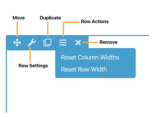
When you hover over a row, you can:
- Move it
- Edit settings
- Duplicate it
- Reset widths
- Delete it
Row Settings Overview
Open Row Settings to customize:
Width
- Full Width: Background stretches across the screen.
- Fixed Width: Row has a maximum width and stays centered.
If using Full Width, you can also set Content Width to Full or Fixed.
Height
- Default: Adjusts to content automatically.
- Full Height: Fills the browser window.
- Minimum Height: Sets a custom minimum height.
Styling Options
- Text and link colors
- Background type: color, gradient, image, video, slideshow, parallax, or embedded code
- Background overlay for better text visibility
- Borders, rounded corners, and shadow
- Top and bottom shape dividers
The Advanced tab includes margin, padding, visibility, animation, and custom HTML options.
Colors
You can override default text, link, and heading colors for the entire row.
Setting text color at the row level is recommended when using dark backgrounds because it automatically applies to all modules inside that row.
Background Options
Rows support multiple background types:
- None
- Solid Color
- Gradient
- Photo
- Video
- Slideshow
- Parallax
- Embedded Code such as video embeds or shortcode sliders
For image, video, slideshow, and parallax backgrounds, you can also apply a background overlay color with adjustable opacity.
Borders and Effects
You can add:
- Borders
- Rounded corners
- Shadow effects
- Top and bottom shape divide
Advanced Tab
The Advanced tab includes:
- Margin and padding controls
- Responsive visibility settings
- Animation settings
- Custom CSS or HTML attributes
Choosing Between New Rows and Column Groups
When building layouts in WordPress using Beaver Builder, you can structure content using either separate rows or column groups within a single row. Understanding when to use each approach helps maintain clean, flexible page designs.

What Are Column Groups?
A row can contain multiple column groups. These function like sections inside a row, allowing you to organize content into structured areas without creating a completely new row.
For more advanced designs, columns can also be nested inside other columns to create complex layouts.
Using Separate Rows Instead
Instead of placing multiple column groups inside one row, you may choose to place each section into its own row. There is no strict rule for when to use one method over the other, but the decision depends on layout and design needs.
When to Create a New Row
Create a separate row when:
- You need a different background color, image, or video for a specific section.
- You plan to save that section as a reusable template.
- You may need to reposition the section later by dragging it.
- You want independent margin or padding control for spacing.
- You want clearer structural separation between sections.
Using separate rows improves flexibility and makes future edits easier.
When to Use Column Groups Within One Row
Use column groups inside a single row when:
- You want multiple sections to share the same background.
- You are building a layout that visually spans across sections.
- You are creating a sidebar style layout within one structured area.
For example, to create a sidebar layout without using the theme’s sidebar, use one row with two columns. Place the main content in the left column and the Sidebar module in the right column. This keeps both areas aligned within a single background section.