Beaver Builder
Bread crumbs / Will Be / Placed / Here / When Available
Color Picker
What It Does
The Color Picker lets you choose and adjust colors in Beaver Builder (backgrounds, text, buttons, links). You can also change hue, opacity, and save color presets.
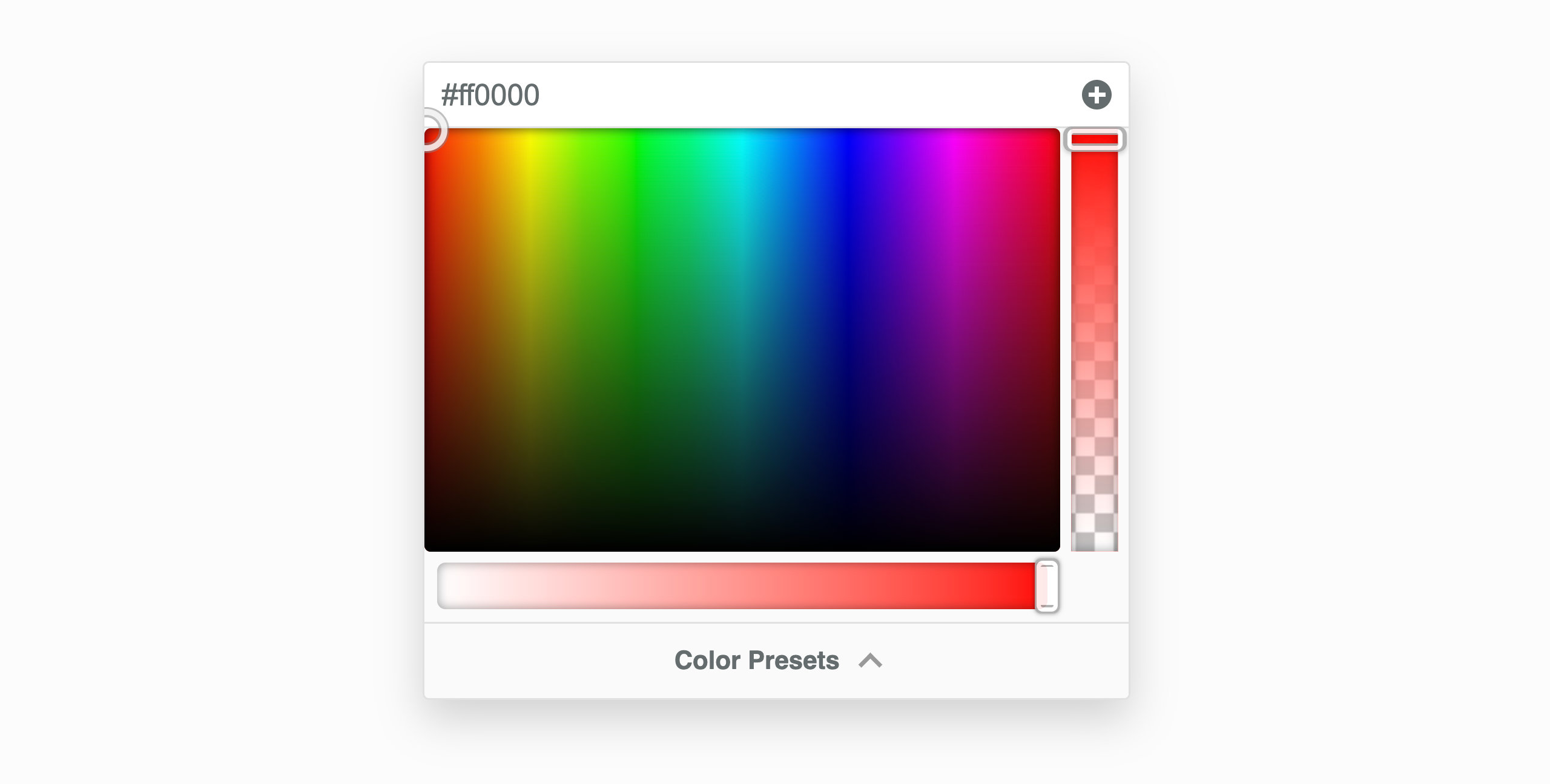
Picking a Color
- Click and drag inside the color area to choose a color.
- Adjusting alpha changes the format from rgb() → rgba().
- You can type color values directly (hex, rgb, rgba, hsl, hsla, or
var(--css-var)).
sRGB Tab
Use this tab to:
- Adjust hue and opacity
- Work within standard web color space
- Use the color scale for quick white, black, transparent, or grey tones
Hue Slider – Changes the color’s shade across the spectrum.
Alpha Slider – Controls transparency.
Mix Tab
Blend two colors using color-mix().
- Grid shows blends from 0% (first color) to 100% (second color).
- You can type
color-mix()directly, e.g.:color-mix(#ff0000, #00ff00, 50%).
Presets Tab
Use preset colors imported from:
- Your theme
- WordPress Core
- Custom presets
Add preset: click +
Remove preset: click X
Eyedropper Tool
Pick a color from anywhere on your screen.
Steps:
- Click the Eyedropper icon.
- Select any on-screen color.
- The picker updates automatically.
Supported Browsers: Chrome 95+, Edge 95+, Opera 81+.
Legacy Color Picker
If you’re using Beaver Builder 2.8 or earlier, you’ll see the older version.
Recommendation: Upgrade to 2.9 for improved color controls.