
Beaver Builder
Bread crumbs / Will Be / Placed / Here / When Available
The Top Bar – Your Control Center in Beaver Builder
The Top Bar in Beaver Builder is your main navigation panel when editing a page or post. It gives you quick access to essential tools — like the content panel, page title, saving status, and publishing options — all from one place. Think of it as your command center for building and managing layouts.
Page Title
At the left side of the Top Bar, you’ll see the title of the page or post you’re currently editing. This helps you confirm that you’re working on the correct page.
Note:If the title doesn’t match the page you’re editing, check out our guide on troubleshooting incorrect titles in the Top Bar.
Tools Menu
Next to the title is the Tools menu — your shortcut to important editing options like duplicating layouts, importing or exporting designs, saving templates, and more.
Learn more: Tools Menu Overview
Notifications Icon
If you’re using the standard version of Beaver Builder, you’ll see a bell icon for news and updates directly from the Beaver Builder team.
- If you’re using a white-labeled version (Unlimited License), this icon may be hidden.
- You can also turn it off with the
fl_disable_notificationsfilter.
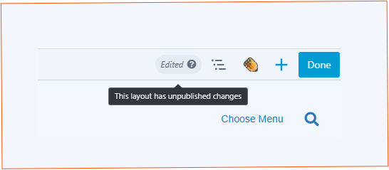
Saving Status
As you work, Beaver Builder automatically saves your changes in the background. In the upper-right corner, you’ll see one of these status messages:
- Saving – Your changes are currently being saved.
- Saved – Everything is saved.
- Edited – There are unsaved changes waiting to be published.
ℹ️Tip:Autosave is powered by WordPress. Developers can change how often autosave runs by adjusting the
AUTOSAVE_INTERVALsetting.
Outline Panel
Click the Outline icon to view a structured outline of your page’s layout. This gives you a quick way to see how rows, columns, and modules are organized — and to jump directly to any part of the layout.
See the Outline Panel article for more information.
Assistant Plugin (Optional)
If you have the Assistant plugin installed, its icon will also appear in the Top Bar. This gives you one-click access to open or close the plugin for even more editing options.
Content Panel
Click the + icon in the Top Bar to open the Content Panel, where you can add modules, rows, and templates to your page. Click the X to close it again.
If you pin the panel to the side of your screen, the icon is replaced with a small show/hide button at the bottom.
The Done Button – Finalizing Your Work

When you’re ready to wrap up your editing session, the Done button (top-right corner) is where you finish things up. Its color tells you whether changes have been made:
- Gray – No changes yet. Click to exit the editor.
- Blue – Edits detected. Choose what to do next:
Options When Clicking “Done”
Pro Tip:Publish regularly to create WordPress revisions. This gives you the option to roll back to previous versions if needed. You can also publish without leaving the editor by choosing“Publish Layout”from the Tools menu or pressing⌘ + P (Mac)/Ctrl + P (Windows).
Best Practices
- Save drafts often when experimenting with design ideas.
- Publish changes in stages to make rollbacks easier.
- If multiple people are editing the same page, communicate before discarding changes — otherwise, work could be lost.